Krasner and Pollock: Past Continuous
Today I did that thing where I knowingly miss the point of the Met, whizzing past its vast collection of antiquities from around the globe in favor of a marquee exhibition of modern American painters. It was Lee Krasner and Jackson Pollock this time, and by far the largest collection of either artist’s work I’ve ever had the privilege of viewing. I was especially keen to dig in on Krasner, as I’m as guilty as anyone of letting her live in Pollock’s shadow. In all honesty, overall, I found her paintings and collages somewhat hit or miss, but don’t read that as a slight, because the hits hit. Take “Shattered Color,” an early work in her “Little Images” period following an extended creative block in the mid-1940s, which I stared at, slack-jawed, for a good long while.
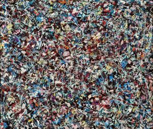
One way I noticed that the couple rubbed off on each other in that pivotal time was their propensity for a busy, all-over abstraction that tends to give off an aggregate grayscale effect. As much as I appreciate that many of those works reward closer inspection with smaller prismatic bursts, I prefer the works whose bold color is more readily apparent, like the one above, and like my favorite of Pollock’s famous drip paintings, “Convergence: Number 10, 1952.”
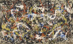
I’m not sure I had gotten to see this one in person before, and I can’t overstate how looking at a smaller version now simply does not do justice to the effect of seeing this mammoth painting up close and at scale.
More art posts

Eno
It’s still a sad mystery how the Philly screening(s?) of Eno, a groundbreaking documentary about famed musician and producer Brian Eno, came and went early last year without crossing my radar. I’ve met the filmmakers, Gary Hustwit and Brendan Dawes, on various occasions in the past and would have loved to say hi and get eyes on Brain One, the generative engine they built for the film, with hardware designed by Teenage Engineering. As the… See more →
Moving on
We’ve been prepping my childhood home for an estate sale taking place in a few weeks, and my primary task has been getting my remaining unsalable old junk out of there. A lot of it has turned out to be assignments from college: a big stack of portfolios filled with charcoal nudes and various graphic design things mounted on black boards with tracing paper overlays for professors’ commentary. Sketches, marker comps, paste-ups, digital prints. Typesetting,… See more →
Claire Tabouret’s Stained-Glass Windows for Notre-Dame Divide French Society, with a Legal Threat Looming
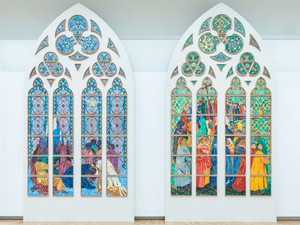
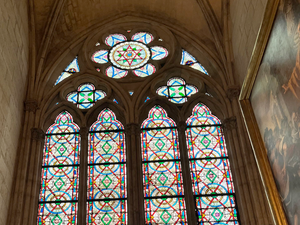
A project has been in the works for a couple years to replace a number of Notre-Dame’s stained-glass windows with contemporary designs, which has unsurprisingly caused an uproar. While the arguments for and against generally take familiar shapes—whether historic architecture should accommodate modern expression, whether these decisions should be top-down or community-driven—one functional aspect of the kerfuffle caught my attention:
The windows’ light gray, non-figurative glass allows more light to enter the cathedral, achieved via… See more →
That was 2025
I got a speeding ticket the other day, my first in probably more than 25 years. After a decade and a half of not owning a car, L and I reluctantly accepted a hand-me-down Hyundai Tucson a couple years ago so we could be more nimble for the sake of our aging parents. Not coincidentally, I’ve been driving it a lot lately, making regular visits to the memory-care residence my mom now calls home, or… See more →
LEGO Bricks Transform into Letterforms in the International Design Project ‘A2Z’
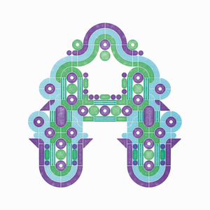
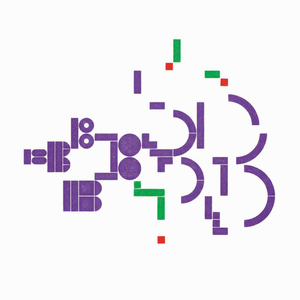
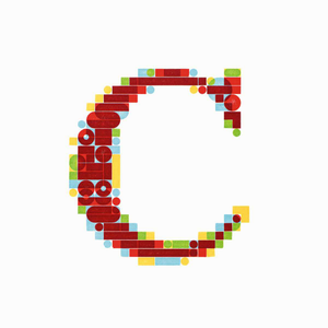
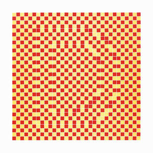
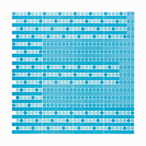
How great is this project? Pedro Neves, a professor at UIC’s School of Design, invited 40 designers from around the world to create letterforms out of Lego, which were then made into letterpress prints. Despite working within the same constraints (a set of bricks and up to three colors from a limited palette), the variety of results on display is wild, and I especially love the many ways people made use of overprinting to stretch… See more →
Brand X Editions: Innovation in Screenprinting
I’ve been threatening to get back into screenprinting for far too long, so this exhibition of prints pushing the medium far beyond its apparent limits seemed like it would provide a good nudge. Not a lot of the content really spoke to me, but this show was really more about technique, and in that regard, much of what was on display was astonishing. In all my years in the game, I can’t say I’ve ever… See more →
Crafting Personal Alphabets: Calder Ruhl Hansen & C.C. Elian

This pair of presentations from Calder Ruhl Hansen and C.C. Elian examines the fascinating writing systems they’ve created at the intersection of typography, calligraphy, hieroglyphics, cryptography, and algorithmic art. Elian is known for Elian Script, which distills the Latin alphabet into simplified forms that can be combined into words in an endless variety of orientations, evoking the expressiveness of Eastern calligraphic traditions. Hansen’s works include an ingenious system of English syllabic pictographs and a means… See more →
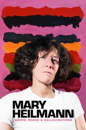
Mary Heilmann: Waves, Roads and Hallucinations
A pretty surface-level look at abstract painter Mary Heilmann, generally more interested in how many cool artists she hung out with and galleries she worked with than in what motivated her actual work.
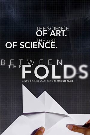
Between the Folds
Constraints are absolutely critical to my own creative process, and I’m more accepting than I used to be of process being part of (or maybe all of) what a creative work is about, as opposed to merely being a means to an end. So I can appreciate the bargain at the heart of origami: A sculptural form is created entirely from folding a single square of paper, with no other materials involved.
I do, however,… See more →