Design
Topic archive / 918 posts
Looking for nominees for "Web Site with Highest Disparity Between Quality of Content and Quality of Design/Build." I nominate allmusic.com.
SXSW has released the podcast of the presentation I did with @jasonsantamaria, Everyone's a Design Critic: 2008.sxsw.com/blogs/podcasts.php…
North by Northwest


The ease with which “Pacific Northwest” is abbreviated to PACNOWE made us feel unwelcome before we even got here, but we were able to resist obeying that imperative long enough to have a very fun day in Seattle.
Most of the day was spent at the Experience Music Project, a museum housed in the first Frank Gehry building I’ve gotten to see in person. The building’s effect was much what I imagined it would be:… See more →
Xanadu


Among thousands of acres of land, a private airstrip, several species of exotic wildlife, and many millions of dollars worth of imported works of art, today belonged to Hearst Castle. I’m speaking, of course, of the incredible and excessive home that newspaper magnate William Randolph Hearst built for himself over the course of more than twenty years in the early-mid twentieth century. As far as I know, it is the closest thing this country has… See more →
Trying to determine which was more saturated with Trajan: Vegas or LA.
It's looking like changing the markup is the only way. Ugh. My pie offer stands.
All responses are appreciated, but so far they all break the design in Safari. My kingdom (and a pie) for a solution that works in both.
A free pie to the CSS genius who can make Firefox wrap the text around the floated-left US state the way Safari does: acrossamerica.robweychert.com
Fake
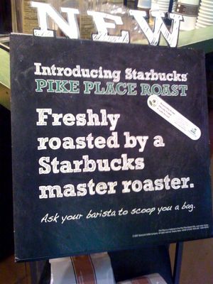
I'm not sure how long this has been part of Starbucks's visual identity, but it's fitting that they should try to co-opt the look of a local coffee shop, completely miss the point, and subsequently reinforce their own corporate homogeny. They may sometimes hire baristas with a creative, independent spirit, but they certainly won't let them anywhere near a chalkboard. Or, for that matter, let an actual chalkboard anywhere near one of their shops. Better… See more →
Rob Across America
Okay, I have to make this really quick, because I’m already leaving much later than I wanted to. Leaving for what, you ask? A month-long, cross-country road trip, naturally. I made a web site for it which is where I’ll be writing exclusively for the next month (not that you expected to see anything new here). My bitchin’ Corolla is leaving Philadelphia momentarily—jump in the passenger seat!
Consumption: April 2008
On the Web
- We Bleed Design: The style is a bit trendy for my taste, but the site employs some very novel and intriguing transitions using a clever combination of JavaScript, CSS, and transparent PNGs.
In the Stereo
- Pharaoh: Be Gone
- Rupa & The April Fishes: Extraordinary Rendition
On the Silver Screen
Hoping I'm not half as dumb as the sIFR documentation is making me feel.
Just had the most pleasant rejection imaginable to my sheepish request that someone at Hatch Show Print show me the shop on their day off.
If your web design podcast's very simple site is needlessly rendered in Flash, it doesn't do much for your credibility. 101webdesignshow.com
All Illustrator documents are closed, but it takes its time quitting. AI is that final party guest who doesn't notice you put on pajamas.
Typesetting the whole of Ulysses on a quarter panel of a 7" sleeve.
Calculating how much I paid for Illustrator to always fuck up my saved workspace arrangements.
Has xScope's Dimensions tool always worked like this and I'm just making a wonderful, belated discovery? urltea.com/335b
Consumption: March 2008
On the Web
- Binary Marble Adding Machine: An amazingly simple wooden machine that performs calculations using marbles. Don’t miss the video demo!
- Muxtape: Remarkably simple site that lets you make a mixtape online. Check out mine.
- Penguin Classics Tumblr Theme: Beautifully rendered by Max Wheeler.
Scowling at the overuse of em dashes for dramatic effect.
Having some fun with two-point perspective.
Seriously, Adobe, fuck you.
Disliking Moo MiniCards, which swim amidst other business cards like petulant children. Standards are useful in non-web places, too, people.
The Itchy & Scratchy & Poochie version of @simplebits's and @beep's M&SS: The Markup & Style & Behavior Society.
South by Southwest Interactive & Film 2008
My fourth year at Austin’s juggernaut of an interactive conference was more of a mixed bag than years past, as both I and SXSW adapted to its growing pains.
This year’s conference was, I believe, about three times the size of my first (in 2005). Daytime sessions expanded to remote areas of Austin’s sprawling convention center, and overcrowded lunch and evening activities tested even Texas’s deft corralling hand. Those who knew the territory well enough… See more →
Looking at some obscenely gorgeous vintage Cuban film posters.
Overheard: "The client wants the donation form to look like the one on Michael J. Fox's site."
Why would you do a panel discussion about logos being irrelevant and not include a graphic designer?
People who don't have that Veer "KERN" sweatshirt are in the minority here.
Flying Southwest Airlines Southwest to South by Southwest
March has arrived, and since college basketball doesn’t interest me any more than a zombified messiah figure selling chocolate or an ophidiophobic Irish folk hero selling Budweiser, March means just one thing: South by Southwest. In just a few days, I will descend on Austin for nearly a week’s worth of quality time with good friends and good ideas. If you see me there, I hope you won’t hesitate to say hello. Here are some… See more →
Grasping the great concept behind the old RCA logo for the first time, and discovering its relationship to HMV: en.wikipedia.org/wiki/Hmv
Ad Specs : Web Design :: Cousin Oliver : The Brady Bunch
Looking for examples of well-designed news/editorial sites with distinct character/personality. Maybe a bit roughed up. Any suggestions?
Consumption: January 2008
On the Web
- Opening the Windows Vista Box: Because it seriously can’t be done without a fucking tutorial.
- Brown Tape Art: Mark Khaisman creates some stunning images with translucent brown packing tape backlit on plexiglass.
- Bobby Fischer, Chess Master, Dies at 64: He may have been an asshole, but man could he play.
- Lasagna Cat: A wonderfully bizarre collection of videos putting Jim Davis in his place.
- The Amen Break: The history of the world’s… See more →
It took 3 of us and a Leatherman to open (read: destroy) the Windows Vista packaging, and we still don't know how it's supposed to open.
digging @bronwynjones's iPhone wallpaper collection: gallery.mac.com/bronwynjones
trying to decide if I'll allow myself to be impressed by the latest personal site redesign from a guy who once ripped off my site's design.
Actually, Illustrator, there aren't any changes to save. I'd expect you to know that better than anyone.
Today's Inman Vs. Glass Layer Tennis match is off to a great start. layertennis.com/080125a
really digging Khoi's illustration in the latest Brief Message: abriefmessage.com/2008/01/25/gupt…
Chicken? htz.ru Egg? comhaltas.ie
conflicted about replicating the design sins of a print publication when translating it for the web.
crammin' ten pounds of shit into a five pound bag.
seeing both sides of the bombshell ALA dropped today, and thinking browsers supporting version targeting will eventually be quite bloated.
Willing to bet this lowercase logotype with a single descender was designed by an only child.
Rotten Tomatoes redesigned. It's shinier and denser, but at least the film pages are a bit easier to skim.
My whole design process is basically an attempt to mine gold from crippling neuroses. That's kind of fucked up.
wishing Photoshop had a throat I could cut.
If the bland cookie cutter housing springing up all around me is allowed to be influential, I weep for Philadelphia's aesthetic future.
predicting that excessive compression artifacts will become a hip retro design trend after lossy compression schemes are extinct.