Design
Topic archive / 918 posts
Windhammer Logo Candidate
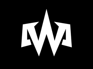
Thanks again to everyone for all the great feedback. After many iterations, this might be the one. I'm gonna see how it sits for a few days. Continued feedback is welcome in the meantime.
Windhammer Logo Comps
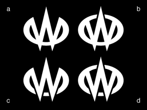
These are variations on a logo for my famed air guitar persona. I think it's close, but not quite there. I've spent a lot of time fussing with the stroke modulation to strike the right tone and balance, and it's time to step back and get some more eyes on it.
What I'm going for:
- Menacing
- Heavy metal and D&D (somewhere between vaguely and overtly)
Likes:
- Good interplay of positive and negative space.
- Doesn't immediately… See more →
Why won't @Adobe let customers create their own CS bundles? I want 6 apps. No bundle has them all; each bundle has at least 3 I don't want.
Knowing how something will work under ideal circumstances is useless.
This is beyond just incompetent design; considering the context, I call it malicious. And it's a de facto standard. yfrog.com/3g4wqdj
Wilco
Too bad the type on the bottom is an afterthought, but otherwise, I quite like this.
afile
CYOA
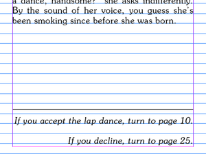
Wait a minute. I'm designing for the screen, but not the web. Well, hello there, vertical grid!
Dust jackets establish books' visual identities, yet are only marginally attached, and must be removed for comfortable reading. Poor design.
Can any bibliophiles out there explain to me how dust jackets are not obnoxiously superfluous?
Morocco
Morocco

Royal

A People's History
#10yearsago I had just finished school and had too many design ambitions to choose from. Thus was the decade defined.
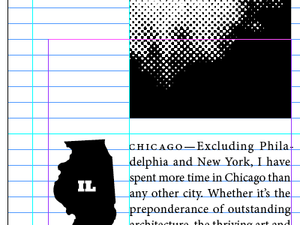
Chicago
A contract of constraints
Get out of my head, Liz.
Secret Santa
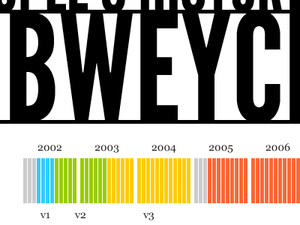
Rob Across America Revisited
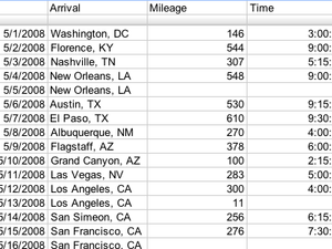
The data entry quiet before the data visualization storm.
When toying with type/lettering ideas, I can now recommend against using the lyrics from The Doobie Brothers' "What a Fool Believes."
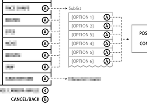
Options
Designers: Take a break and make a list of the design principles used in your current project. You'll be amazed by how much you've learned.
Icons of the screen icon - Wired UK
With all due respect to Mr. Schachter, one of these things is not like the others.
Type Chess
This is great, but I do wish the knights were each represented with an N, as they are in proper chess notation. pushes up glasses
In Sugar We Trust
When I was growing up, holidays offered early indications that communication design was in my future.
Determined to avoid disappointment on Christmas morning, I made what I wanted perfectly clear to both Santa Claus and my parents, constructing lists that were not only categorized and prioritized, but cross-referenced with several catalogs.
My approach to Halloween was no less meticulous. Putting together appropriately macabre costumes certainly appealed to my creativity, but as a child of the… See more →
Exit Strategy
In 1993, Washington DC’s fertile indie rock scene gave birth to a band called The Dismemberment Plan. Musically, it skirted genre conventions inconspicuously. Lyrically, it found wisdom and poetry in the commonplace. The whole package was a rare, fun, magical blend of sophisticated and approachable, and the band built a respectable and devoted following with it.
Ten years later, not long after releasing its fourth and arguably best album, The Dismemberment Plan decided to call… See more →
Bon Iver
Conceptually trite and kinda sickeningly precious, but the visual thinker in me still likes it.
The limitations of a new system are more conspicuous (but not necessarily more numerous) than those of a conventional system.
I would be less cranky about someone beating me to this band name if they were doing it the proper typographic justice: bit.ly/xhict
Just noticed a handful of interrobangs in the Wingdings 2 character set.
Finally figured out indexing in InDesign. A bit clunkier than I expected.
A Visual History of Typefaces and Graphic Styles, Volume 1 (1628–1900) has arrived, and I am in love. amazon.com/Type-Visual-Histor…
Astonished by the simple beauty of Vectorpark's latest diversion: windosill.com
IKEA says goodbye to Futura
No no no no no no no no. No.
Congrats to @jasonsantamaria and the whole @typedia team on today's launch! Typography geeks, welcome to your new home: typedia.com
Hey Philly, when did the PECO building's news crawler ugrade to this full-color, graphical affair? Too much opportunity for yuck.
Congrats to all at Happy Cog and Airbag on their exciting merger today! A match made in heaven: happycog.com/news/2009/08/mer…
iQ font
I don’t think the font itself has much going for it beyond the gimmick, but I am completely amazed by that driver’s control.
Guerrilla typography
Remember Kevin’s design vigilante concept? This guy is doing it. Awesome.
Relieved to find that in my time away from Flash, it has not ceased to be buggy as fuck.
No Doubt
This is part of a massive series for the current No Doubt tour, and they’re all pretty nice. Check out the rest.
The Human Printer: CMYK by hand
I was blown away by this until I learned that they’re just doing separations in Photoshop and tracing them. Still kinda cool.
What would you do with sixty square pixels (10x6) and between three and six colors?
The one time I want to use a book's endpapers for notes, the content is printed cover to cover.
Please direct your thebeatlesrockband.com accolades toward @Jchausse @fishmcgill @ladyczerach @Mr_Terrific @naughtandcross @iamrumz @rubytoo
What is a style but a set of constraints?
Typography Two Ways: Calligraphy With a Twist
Why is Scott Kim the only ambigram artist given credit here?
Two Pages
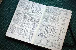
Featuring some (ultimately rejected) Krylon thinking, apartment-hunting notes, and other miscellany circa May 2007.
Contributing to @jasonsantamaria's nifty "Pretty Sketchy" Flickr pool: flickr.com/photos/robweychert…