Design
Topic archive / 918 posts
Unscientific
AIGA vs Dribbble
Sigh.
Shop Vac
The song is bland as hell, but the video is really, really well done.
Misfits
I would have omitted the Misfits logo, made the eyes completely black, and dialed the date back thirty years, but still, this is pretty rad.
Attempted a 2D scale drawing of my 2008 road trip: x-axis distance (9403 mi), y-axis altitude (766 ft). Not my best idea, as it turns out.
Demeanors

Teenbeat Records, Band +/- Sue Factory Design Legend Peter Saville Over Joy Division Box Set
Oh, fuck you.
Confession: I’m still pretty clueless about pro display calibration and working with Photoshop color profiles. Resource suggestions?
Legacy of Letters (by Luca Barcellona) Typographic mediation...
This is for those of you poor fools who labor under the illusion that you are or one day will be good at something.
Halfsleeve
Analog
Kid Ikarus
I can’t put my finger on what I like so much about this poster. I do know that something about its seemingly random noise invited me to explore it, and that the actual information is easily discernible despite that noise, thanks to a clear focal point and succinct text.
Designers: Don’t forget the “In heads and titles” part of “use the best available ampersand.” And use your head. Not all pairings are magic.
Treat your eyes to lostworldsfairs.com, courtesy of @jasonsantamaria, @fchimero, @TrentWalton, @weightshift, and @davatron5000.
Suddenly smitten by the shape of the Anchor Steam bottle. I can’t stop looking at it. It’s wonderful. And yes, I’m sober. anchorbrewing.com/beers
Rock Band 3 New Features: Music Library
Of all the stuff I worked on at Harmonix, this is easily the thing I spent the most time on.
Designer’s block leads me to edit iTunes metadata which leads me to discover that the early Buzzcocks singles were very nicely designed.
The true story behind @mike_ftw’s perfectly succinct “I’m not angry, I’m from Philly” t-shirt: philly.com/inquirer/world_us/…
Can one of you CSS geniuses remind me why definition lists won’t take list-style declarations?
RWDC
HOW Blog | Graphite Letters
Jesus.
Irony: The more semantic of the two solutions to my HTML problem involves a somewhat complicated table.
Torn between design solutions. A: Acceptably pragmatic HTML and easy CSS. B: Complete pedantry. Granular, semantic HTML and nightmarish CSS.
My Designing Obama book arrived today. I can't wait to look at it after I'm done smelling it.
A work of graphic design receives no greater care than when one sets the words "I fucked up" in large display type for an audience of one.
Wired on iPad: Just like a Paper Tiger
I haven’t tried the Wired iPad app yet, but my nodding-in-agreement bordered on headbanging when I read this:
Let’s make this clear once and for all: at the current surface and resolution of the iPad, multi column layouts for long screen texts are sentimental nonsense.
Am I alone in thinking that anyone who considers Marlboro's F1 bar code trick "genius" is far too easily impressed? bit.ly/903omR
Penmanship of the 16th, 17th, and 18th centuries
And it’s not even my birthday yet.
My guess is that experience designing bicycle helmets has never shared space on a résumé with a BFA.
Harmonix is looking for a senior web designer. Is that you? tbe.taleo.net/NA3/ats/careers/req…
Congrats to @vpieters on the launch of her beautiful new site redesign! veerle.duoh.com
Somehow, it's been years since I last did a Photoshop batch process. Forgot how satisfying it can be.
Logo Faves | Logo Inspiration Gallery » Blog Archive » Spartan golf club
Pretty neat trick.
Nuclear Reactor Cutaways
I am such a sucker for this stuff.
Just finished @adactio's forthcoming HTML5 for Web Designers from @abookapart. Unsurprisingly, it is excellent. books.alistapart.com
Considering going to the Future of Reading conference next month at RIT. futureofreading.cias.rit.edu/2010…
Of course the tattoo epiphany I've been waiting for comes on the day I promised myself I wouldn't turn on my Mac.
RAINBOW IN YOUR HAND
Ingenious and beautiful.
Really? People are posting NDA work on @dribbble? Are they stupid or just stupid?
There is still too much blue on the web.
Windhammer Belt Buckle
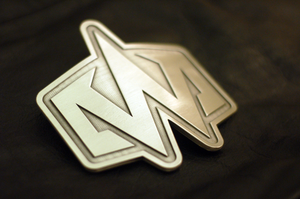
Well, the logo is sure as shit final now.
One of a kind, designed by yours truly and fabricated from pewter by the good people at Ace Buckles.
GDC: The UI of The Beatles Rock Band
This is light on actual information, but for any UI folks interested in how shit happens here, these slides give you a glimpse into the process.
Dan Roam is my new hero. Full stop.
To typeset a book about traffic without regard for your chosen typeface's ffi ligature is to make a grievous error.
The Panic Status Board
Awesome. I’m thinking about making a screen saver for myself inspired by this.
Random thing I miss from Philly: The way the fancy lettering on the Bellevue food court's Full of Soup sign makes it look like Fall of Soap.
Q: Does the fact that it is an AIGA "event" make a film screening worth $20? A: No.
Windhammer (Almost) Final Logo
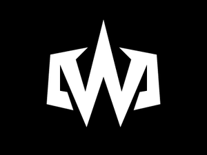
I knew something wasn't quite right about the last iteration, and it had to do with the wingy things on the sides, which felt oddly arbitrary. When I showed it to my partner in crime, she said, "Where's the hammer?" Boom.