V7: Typographic scales and technical pens
A flexible system for consistent stroke widths across type sizes
Before vector art, high-DPI raster image processing, and retina screens took over the world, if someone wanted to draw very fine and precise lines, they relied upon steady hands, cork-backed metal rulers, French curves, and a set of expensive technical pens. The Rapidograph pens I used in college could be a headache to maintain—don’t let that ink dry in the nib!—but the results were worth it: pull one of those pens across a fresh sheet of Bristol board and get a reliable, unwavering stroke width every time, a fraction of a millimeter thick.

Koh-I-Noor still makes a version of the pens I had, and I salute the artists keeping the tradition alive, but apart from the (much cheaper) Micron pens I sometimes use in my sketchbooks now, I’ve mostly moved on to more convenient digital processes for production-ready line-making. Still, the reverence for the consistency of a mechanical line those pens instilled in me lives on, and it’s led me to borrow visual concepts from technical drawing disciplines to see how they might apply to typography.
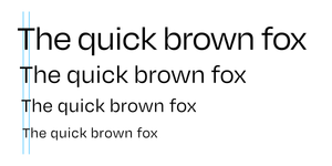
Here’s the basic idea: I want all the type on my site to look like it was drawn with one of two technical pens, a standard one with a thinner stroke and a more emphatic one with a thicker stroke.
This is something of an experiment, to be sure, but not only for its own sake. This is a big site with a big amount of text, and the typography has a lot of work to do. One of the ways it can help make a busy page visually manageable is by using a typographic scale with a limited set of sizes, and using a limited set of stroke widths is an extension of that idea.
On its face, it might sound fairly uncomplicated: use a Regular weight and a Bold weight and you’re done. But that mistakes the idea for being simpler than it is. Two considerations—contrast and size—will show that there’s more work to do.
Contrast
Typefaces are adaptations of handwriting, and handwriting’s form is shaped in part by the stylus it uses. Most serif typefaces are based on letterforms produced with a broad nib pen held at a natural writing angle, which tends to make horizontal strokes thinner than vertical strokes. The greater the difference in thickness between a typeface’s various strokes, the greater its contrast is said to be. Since I’m aiming for a consistent stroke width, a high-contrast typeface won’t fit the bill.


The typefaces with the lowest contrast are, more often than not, geometric sans-serifs. These are made from idealized geometric forms: circles, squares, triangles. They have their place, as evidenced by the fact that you see them everywhere these days, especially in digital product design. But since I’ll be typesetting prose written in my own voice, I want something a little less sterile, something that splits the difference between the human warmth of a contrasty serif and the mechanical consistency of a geometric sans.

After I dug around for a while and tried several different fonts, Jason Santa Maria helpfully suggested OH No Type Co.’s Degular, and that’s where I landed. Degular has a good amount of personality without sacrificing legibility, and with seven weights and three optical sizes, it’s extremely versatile. Its geometry is tidy without feeling rigid, which contributes to its distinctive character, and that character’s secret weapon is selective contrast: stroke widths are generally consistent except for the lowercase joints, and that selectivity keeps the contrast subtle, especially at lighter weights.
Size
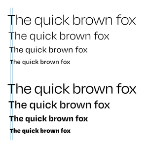
If I were only using Degular at one size, I’d be ready to fly the “mission accomplished” flag, but as it happens, my design makes use of a range of sizes, and as the type gets bigger, so do its stroke widths.
To keep stroke widths consistent across sizes, the type’s weight needs to be inversely proportionate to its size: I’ll need to use lighter weights for the larger sizes and heavier weights for the smaller sizes. Degular’s seven traditional weights, from Thin to Black, are certainly helpful for this task, but even more helpful is the Degular Variable font. Its weight axis allows for great precision, with a range of hundreds of possible weights.
To start figuring out what weights to use, let’s first take a look at the type sizes I’m working with. My typographic scale has a base body text size of 24 and an interval of 1 1/3, which means each size on the scale is 1 1/3 times the size preceding it. Sizes move in both directions from the base: larger sizes multiply the next smallest size by the interval, and smaller sizes divide the next largest size by the interval.
| Size | Calculation |
|---|---|
| 42.667 | 32 × 1 1/3 |
| 32 | 24 × 1 1/3 |
| 24 | N/A (base size) |
| 18 | 24 ÷ 1 1/3 |
This same principle can be applied to the type’s weight. However, since I want the proportional weight to decrease as the type gets larger and increase as the type gets smaller, the operations are inverted: weights for larger sizes use division, and weights for smaller sizes use multiplication.
| Weight | Calculation |
|---|---|
| 225 | 300 ÷ 1 1/3 |
| 300 | 400 ÷ 1 1/3 |
| 400 | N/A (base weight) |
| 533.333 | 400 × 1 1/3 |
As with other fonts, on Degular Variable’s weight axis, the numeric equivalent of a Regular weight is 400, which is my base weight in the table above. Changing the base to 700 will give me a bold weight and adjust the scale’s other weights accordingly. In both cases, all the sizes in the scale now have stroke widths consistent with that of the base size at the base weight.
Working smarter with CSS
Now, I could just plug those size and weight numbers into my CSS and leave it at that. But if I decide to make any tweaks, I’ll have to redo the above math every time I change something. I’d rather have CSS do the math for me. So let’s take a look at how to set that up. First, I’ll need to reconfigure the above calculations a bit and distill them into some useful formulas:
That d exponent refers to the scale degree, or how many steps away from the base the size or weight in question is. The baseline scale degree is 0, larger sizes are positive, and smaller sizes are negative. Here are those formulas at work on my typographic scale:
| Size | Weight |
|---|---|
| 42.667 = 24 × (1 1/3)2 | 225.000 = 400 ÷ (1 1/3)2 |
| 32.000 = 24 × (1 1/3)1 | 300.000 = 400 ÷ (1 1/3)1 |
| 24.000 = 24 × (1 1/3)0 | 400.000 = 400 ÷ (1 1/3)0 |
| 18.000 = 24 × (1 1/3)-1 | 533.333 = 400 ÷ (1 1/3)-1 |
Before I translate the formulas into CSS, I’ll start by setting a default font-size on the html element:
html {
  font-size: calc( 100% * (24/16) );
  /*
    My actual default font-size is a
    more fluid clamp() situation, but
    we’ll save that for another day.
  */
}
Let’s take a moment to unpack this part, because it’s a core concept of web typography that I think is still too little understood by many people writing CSS.
The html element effectively sits at the top of the cascade, so its rules set the defaults for the document. But its font-size is extra special, because it’s the basis for the document’s rem, or root em. Anywhere a rem unit is used, it’s relative to that default font-size at the top of the cascade (in programming terms, it’s like a global variable), unlike an em unit, which is relative to the font-size wherever the em is currently being used (like a local variable). If, like me, you want to maintain a consistent set of proportional type sizes in your design, the rem is indispensible.
Not only is the rem incredibly useful for typographic scales, but when its basis is set correctly, it respects the user’s preferences. For many years now, most browsers’ default font-size has been 16px. In the broad range of today’s screen sizes and resolutions, 16px can feel pretty tiny, so it’s not uncommon for designers to bump it up a bit. We can see that happening in the above font-size. Its calculation increases the assumed size of 16 to 24, but note that the px unit is nowhere to be found. The calculation resolves to 150%; if the default size is 16px, it has now been increased to 24px. But the browser’s default size can be adjusted by the user. Say someone with low vision set the default size at 30px. If, instead of a calculated percentage, I had simply set the font-size as 24px, that would be too small for that user. Instead, 150% of 24px is 36px, which they’ll have a much easier time reading.
To embrace the rem is to embrace the flexible nature of the web. I very rarely use px units in my CSS, because the body text is the core unit of measure for most of the sizing happening on my websites, just as it is when I’m designing a printed book. Except that on the web, if I—or the user—adjusts the default font-size, the rest of the rem-based design automatically adjusts with it.
OK, lecture over! Let’s get those scale formulas into the CSS, beginning with custom properties with default values for the scale interval (i), scale degree (d), base size (b), and base weight (B) variables:
html {
  --scaleInt: 1 + (1/3);
  --scaleDeg: 0;
  --baseSize: 1rem;
  --baseWght: 400;

  font-size: calc( 100% * (24/16) );
}
I hope you’re waving to our friend 1rem, the --baseSize value. Now, remember the size and weight formulas? They’re back, in calc() form:
*,
*::before,
*::after {
  font-size:   calc( var(--baseSize) * pow( var(--scaleInt), var(--scaleDeg) ) );
  font-weight: calc( var(--baseWght) / pow( var(--scaleInt), var(--scaleDeg) ) );
}
How handy is that pow() function? In this case, it calculates --scaleInt to the power of --scaleDeg—e.g. (1 1/3)2—which you’ll hopefully recognize, along with the other variables and calculations of the CSS-translated formulas here.
I’m still a little fuzzy on how variable custom properties used in conjunction with calc() work within the cascade, but I believe putting these declarations in a * universal selector essentially bypasses font-size and font-weight inheritance and reruns the calc() functions for every element, using the most relevant custom property values available. And so, with this compact engine in place, I can now adjust --scaleDeg and --baseWght with specificity to easily set type at sizes consistent with my scale and with stroke widths consistent across sizes, like so:
h2 {
  --scaleDeg:   2; /* font-size resolves to ..... 1.78rem */
  --baseWght: 700; /* font-weight resolves to ... 393.750 */
}
h3 {
  --scaleDeg:   1; /* font-size resolves to ..... 1.33rem */
  --baseWght: 700; /* font-weight resolves to ... 525.000 */
}
p {
  --scaleDeg:   0; /* font-size resolves to ..... 1.00rem */
  --baseWght: 400; /* font-weight resolves to ... 400.000 */
}
figcaption {
  --scaleDeg:  -1; /* font-size resolves to ..... 0.75rem */
  --baseWght: 400; /* font-weight resolves to ... 533.333 */
}
Extending the metaphor
I’m glad to have the type where I want it, but I can’t call it a day just yet. There are other linear design elements on the site, and with the stroke-width precedent set, I need to bring them in line (pun intended) with the type.
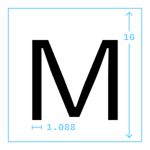
Let’s start with border widths. Since I know my base text size is 1rem, the base stroke width can be calculated from that. I’ll use a vector app to set some text in Degular Regular at a size of 16 pixels (again, the default value for 1rem in most browsers), and then convert that text to outlines, which will make it easier to measure. The width of the stroke measures 1.088 pixels, which I’m satisfied to round down, making the stroke width one sixteenth of the type size. Multiplying that by 1rem gets me a custom property consistent with my type’s standardized stroke width:
html {
  --borderWidth: calc( 1rem * (1/16) );
}
But remember, the size of 1rem is subject to the user’s preferences, and we’re already looking at a pretty thin line, so it’s possible the above calculation could return a number small enough for the browser to round down to 0. To avoid that, I’ll wrap it in a max() function to make sure it never gets smaller than 1px:
html {
  --borderWidth: max( 1px, calc( 1rem * (1/16) ) );
}
I’ve also noticed that on low-resolution screens, some browsers inexplicably render invocations of this custom property inconsistently in different contexts (e.g. border-width versus text-decoration-thickness). So I’ll add a media query for those situations:
html {
  --borderWidth: max( 1px, calc( 1rem * (1/16) ) );

  @media (max-resolution: 1dppx) {
    --borderWidth: 1px;
  }
}
Nevertheless, for some browsers (ahem, Safari), that’s still not good enough, but rather than develop an ulcer trying to hack my way around it like it’s IE6 and I’m still in my twenties and death may never come, I’m going to let it be and move on.
Don’t forget the icons
There are still more lines appearing throughout the site, such as those forming my icons, which are rendered with inline SVG. With all strokes and (mostly) no fills, the icons are designed as a sort of extension of the type, so I can’t very well exclude them from the technical-pen party.
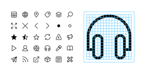
Remembering the earlier discovery that Degular Regular’s stroke width is a sixteenth of its size, I drew the icons on a 16×16 grid. And to give their stroke widths a little room to grow without being cut off, I added some extra space on the edges, making the viewBox 18×18. Here’s the markup for the above-pictured headphones icon:
<svg class="icon icon--headphones" viewBox="0 0 18 18" width="18" height="18">
  <path d="M3.5,13.5h-2v-4.5C1.5,4.86,4.86,1.5,9,1.5s7.5,3.36,7.5,7.5v4.5h-2"/>
  <rect x="11.5" y="8.5" width="3" height="8" rx="1.5" ry="1.5"/>
  <rect x="03.5" y="8.5" width="3" height="8" rx="1.5" ry="1.5"/>
</svg>
And here’s the CSS relevant to the task at hand:
.icon {
  inline-size:  calc( 1em * (18/16) );
  stroke-width: calc( 1px / pow( var(--scaleInt), var(--scaleDeg) ) );
}
The stroke-width formula is identical to the font-weight formula we covered earlier, which increases the stroke width at smaller sizes and decreases it at larger sizes, except that since we’re styling path and rect elements rather than type, the dividend is now a more SVG-native 1px. The inline-size calculation takes into account that the icon’s stroke width is based on 18 and the type’s stroke width is based on 16. Making .icon slightly bigger than the type will keep its stroke width in proportion with the type’s.

Caveats and conclusions
Some things to keep in mind if you decide to try something similar:
- There are plenty more little details at work in the concept that I didn’t get into in this post: fluid typography, optical size, and other SVG applications, as well as considerations of viewport size, screen resolution, and dark mode.
- I’m not an expert on performance, and it’s possible that all the
calc()going on here is expensive, but it hasn’t had a noticeable impact on the devices I’ve tested so far. - Typographic scales can be formulated in many ways, and deviating from the single-interval system I’ve outlined here may require some modifications to the setup. Using multiple fonts may likewise change the game. I think the core idea is pretty adaptable, but as with most things, your mileage may vary.
Overall, I’m pleased with the result! Like much of what I do as a designer, it’s not an exact science and it’s essentially invisible to most viewers, which can feel anticlimactic, but I think it’s brought a certain calm to these pages they wouldn’t otherwise have. And behind the scenes, the concise, intuitive code implementation is satisfying. That said, if the preceding 3,000 words are any indication, I’m probably too close to it, so if you have opinions (and if you’ve read this far, you’ve earned them!), I’d be happy to hear them.