Design
Topic archive / 918 posts
Both tags are stupid, but as a designer, I’d rather be described as a “ninja” than a “rockstar.” More about efficiency than flamboyance.
Links: February 2016
The NYPD Is Kicking People Out of Their Homes, Even If They Haven’t Committed a Crime
“It’s an action about a place. It’s not about people,” says the NYPD, as it evicts innocent people from their homes.
The Lives and Lies of a Professional Impostor
“I think he doesn’t know where the lies stop and the truth starts anymore.”
Everyone Hates Martin Shkreli. Everyone Is Missing the Point
Last fall, Derek Lowe, a chemist and… See more →
Digital timekeeping via an analog sundial. Amazing. thisiscolossal.com/2016/02/a-3d-p…

The candidate illustrations @benkirchner did for @washingtonpost’s 2016 election coverage are pretty fantastic.
I’m late to the Sass party, but a day after rereading @simplebits’ Sass for Web Designers, I have the bones of my own custom grid framework.

Today I learned that @AOL’s homepage has a carousel with 42 articles in it, all of them weirdly bland clickbait.
Links: January 2016
The Website Obesity Crisis
Everything we do to make it harder to create a website or edit a web page, and harder to learn to code by viewing source, promotes that consumerist vision of the web.
The 2015 ProPublica Year in Visual Storytelling
A nice roundup of ProPublica’s more visually and interactively rich stories from the past year.
Animated homage to The Wire
When I hear Blind Boys of Alabama’s cover of “Way Down in… See more →
Designers: Here’s a chance to do great work with some mega-talented people in Philly. twitter.com/hoyboy/status/…
A nice roundup of @propublica’s more visually and interactively rich stories from the past year. propublica.org/article/2015-p…
Since I use ⌥⇧⌘S, I had no idea Photoshop’s “Save for Web” was deprecated. (And I totally forgot about ImageReady!) zeldman.com/2015/11/17/sav…
A nice, ongoing roundup of little things that too easily fall by the wayside when designing and developing websites. twitter.com/coryetzkorn/st…

“Hotels have mattresses! And keys. And it’s a scary hotel. So here’s a scary mattress lady with a key in her face.”
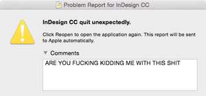
Nearly two decades into the pro design game, I’m still like:
Day 1: “Ah, this is it! This is the solution!”
Day 2: “Oh. Nope. Won’t work.”
Boston web people! My pal @rubytoo is wrapping up an epic run at @Harmonix and looking for UX and visual design work. rubytoodesign.com
Philly design people! My old @Harmonix buddy @KingSpaceLaser will soon be your neighbor and is looking for work. michaelgeorgeson.com
I hope this gets more fleshed out, but props to @jenniferdaniel for calling out design’s self-importance epidemic. medium.com/@jenniferdanie…
Updated my @gimmebar with a lengthy backlog of assorted visual stunners, most of which come from @Colossal. gimmebar.com/loves/robweych…
I really hope @Brownstein_Grp makes more of these great Philly signage prints. Lots of folks would love to have them. underconsideration.com/fpo/archives/2…
Web designers: If you, like I, somehow didn’t know about CSS counters, here’s a use case that will improve your life: 456bereastreet.com/archive/201105…
IMHO, if you’re a person who knows better, it is not okay to ever use dumb quotes or dumb apostrophes. Not in email, not in texts, not ever.
Shopping for athletic shoes is fun because almost every single pair is completely hideous.
I guess Mad Men – by some accounts, television’s aesthetic pinnacle – is riding out this end-credits-set-in-Arial thing to the bitter end.
Airistotle

Maybe there’s a better method than the one I concocted, but achieving this effect was more complicated than I expected. It needs some cleanup, but I’m happy with the result.
They should change the name from Adobe Illustrator to Adobe Gaslight.
Gold is tacky.
This is the most exciting piece of software I’ve seen in ages. It will make doing design on the go so much easier. duetdisplay.com
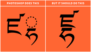
Anyone know how to get Photoshop (Mac) to play nice with Tibetan type? Specifically vowel stacking. @AdobeCare
You guys? I love America and all, but our flag is UGLY.

This is the highest honor I have ever received as a designer.
Hey everybody. My pal @jasonsantamaria wrote an excellent book called On Web Typography, and it is available today! abookapart.com/products/on-we…

Time to put the grief to work.
Chloe
A eulogy for a friend.
After politely listening to one of my diatribes on the untapped potential of music metadata, Jeremy Keith introduced me to the work of Chloe Weil in the fall of 2012, specifically Sound of Summer, which dynamically collates the songs that soundtracked her summers dating back to 2001. I was fascinated by the project, but didn’t get around to actually meeting her until Jeremy introduced us in person a year later at Brooklyn Beta, and we… See more →
On my way to #generateconf for the day.
Are we ready to collectively acknowledge that hand-lettered creative platitudes are just corporate motivational posters in designer clothes?

Another great album cover that led me to a great band. Foil stamping is a trick digital distribution can’t replicate.

Let’s see an album you picked up solely because of its cover, and the music turned out to be amazing.
“Experts may have the best answers, but beginners have the best questions.” Food for thought from @dkr. the-pastry-box-project.net/d-keith-robins…
Web designers: what’s the latest and greatest resource on best practices in web form design? The landscape has shifted since @LukeW’s book.
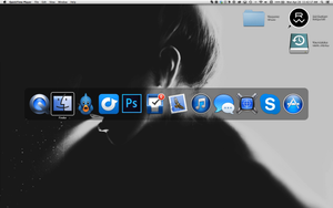
Attention software branding/icon designers: there are colors other than blue that are available to you.
A pretty fantastic collection of lurid VHS box art: vhscoverjunkie.tumblr.com /cc @iamrumz
Looking for a font that evokes sports, with several weights and widths for display and small amounts of text (à la Knockout). Suggestions?
Beyond Pixels: Air Guitar
The plush, brightly lit green room at the House of Blues on Sunset Boulevard in Los Angeles is clean, colorful, and carpeted, with two large couches, a bathroom with a shower, and an abundance of mirrors. It is probably the most spacious and comfortable backstage area of any we’ve encountered, but it’s still inadequate. Between organizers, performers, friends, and photographers, the room is at more than twice its capacity, topped off with a showgirl’s ransom… See more →
This is how Adobe Illustrator and I are getting along these days. bukk.it/bad-day.gif

Really impressed with the handsome new @nGenWorks site. Simple, bold, fun, and looks great on screens of all sizes. ngenworks.com
The 30 Years of Mac icon font is surprisingly sloppily drawn, and has odd lapses of detail (e.g. wrong aspect ratio for TiBook-era laptops).
So @squarespace’s amateur website creation tools are okay but their amateur logo creation tool is bad? I don’t get what the problem is.
Finished my @unmatchedstyle CSSOff 2013 entry:
<html>
<body>
<img src="cssoff-2013.png" />
</body>
</html>
/cc @danielmall
Reviving my poster/print collection, but I fell a bit out of touch with the scene. Silkscreen/letterpress artist/designer recommendations?