The Markup
A homepage redesign for a nonprofit newsroom
Graphic design, UI/UX design, web design, code
The Markup, a journalism nonprofit focused on technology’s effects on society, had had a successful first few years, and it was time to rethink their homepage. I worked with a group of stakeholders representing the editorial, business development, and product teams to craft a page that better communicated how the organization’s mission had evolved.
Beginning with data from a reader survey and a detailed list of ambitions The Markup provided, I guided them through some exercises to get consensus around how their goals should be prioritized. We ultimately agreed that the homepage should be an even mix of marketing and news, and it had these three main jobs:
- Inspire donations from high-level donors
- Keep donors informed about the work they’re funding
- Introduce The Markup to the uninitiated
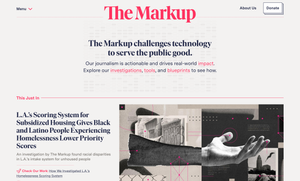
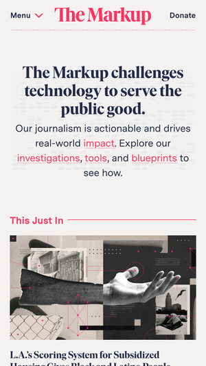
After several rounds of mockups and discussion, the homepage design I created began with a succinct statement of The Markup’s reason for being, followed by links to its four pillars:
- investigative journalism
- detailed methodologies to help other journalists do similar work
- tools to help the general public navigate technology safely and assist with investigations
- the real-world impact this work has
Each of these pillars has its own section on the homepage with a brief description and relevant recent articles. The layout accommodates up to four articles per section, depending on what The Markup wants to highlight at any given time, and each article listing can also showcase related links, demonstrating how the pillars intersect.
Due to a variety of scheduling factors, we had just two weeks to do all this! The process required intense focus from all involved, but we pulled it off. My final documentation, Figma mockups, and HTML/CSS template were delivered on time and implemented soon after.