Design
Topic archive / 918 posts
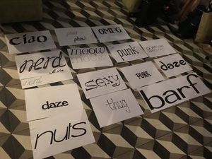
Fun times at @DaltonMaag’s Type Drink & Draw tonight!
Not many people will be qualified to advise on this, but my September now requires a choice between @thejesuslizard and @xoxo. Help! 😫
Finally made a quick Windhammer one-pager. Brutalism seems appropriate for the subject. Happy to hear suggestions. windhammer.org
Links: June 2018
Hello, dear reader!
June is gone, but its links remain.
It was a relatively busy month on my site! I had an unexpected reason to revisit an animated student film I made 20 years ago, wrote about designing better concert listings, chronicled my experience learning about the future of typography at the Ampersand conference, and offered middling reviews of the year’s most celebrated horror films, A Quiet Place and Hereditary.
This month’s links are the sort… See more →
Ampersand 2018
My takeaways from a day of talks on the future of typography
I’m in England (for the first time!) where I’ve just attended Clearleft’s outstanding Ampersand conference in Brighton. I was a little concerned that the combination of jet lag and the (otherwise excellent) venue’s warm temperature would make it hard for me to focus, but the lineup of speakers was more than engaging enough to overcome those obstacles. The most discussed topic of the day was, unsurprisingly, variable fonts, support for which has begun… See more →
So many fascinating details in this delightful architectural tour of Grand Central Terminal. youtube.com/watch?v=_b4XQU…
“By embracing the cumbersome, painfully slow nature of my workflow, I was in a way trying to commune with my computer graphics forefathers.” twitter.com/kottke/status/…
Registered! twitter.com/xoxo/status/10…
The rich, expansive adventure in The Legend of Zelda: A Link to the Past is 1MB. The entire game. Do our 5MB web pages offer 5× that value?
Designing Better Concert Listings
How to make it easier for music fans to find shows
I’m an avid consumer of live music, and New York City offers a ton of concert options on any given night, so I spend a lot of time poring over listings to make sure I don’t miss anything good. One of the primary ways I find out about shows is email marketing; I probably average about two dozen emails each week from various venues and promoters. And I can’t help wondering how much easier it… See more →
“Complexity is good for convincing people they could not possibly do your job. Simplicity is good for everything else.” twitter.com/alistapart/sta…
Links: May 2018
Hello, dear reader!
May is gone, but its links remain.
The only thing I published on my site this month was a brief, snarky review of a 69-year-old movie (nice), but if all goes well in June, I’ll have a couple of substantial posts about creative projects (new and old) coming your way.
The links below include some meaty reporting on politics and a triptych of opinion pieces on our culture wars’ state of discourse.… See more →


This delightfully inventive lettering is a pretty good way to start your day. thisiscolossal.com/2018/05/multi-…
“It’s difficult to imagine a narrow research question about fonts whose results could be extrapolated to every possible context.” twitter.com/kupfers/status…
Links: April 2018
Hello, dear reader!
April is gone, but its links remain.
I’ve been obsessed with my current personal project lately (more on that soon), so apart from a handful of very brief movie reviews, I didn’t do much writing in April, though the web designers in the audience might want to take a look at my notes from last week’s Generate conference.
The links this go-round include some gems for Prince fans on the second anniversary of… See more →
Generate New York 2018
My takeaways from two days of talks on all things web design
The Generate conference made its annual visit to New York at the Metropolitan Pavilion in Chelsea from April 25–27. This was my second Generate, and unlike my first one (in 2014), it was a single track, which I much prefer.
Donna Lichaw: Story First: Crafting Products That Engage
Donna is the author of The User’s Journey: Storymapping Products That People Love. She applies her experience as a filmmaker to helping people take a narrative approach… See more →
Thank you all for the suggestions! Good stuff. I’m hoping for a future where variable fonts and container queries/units make this easier. twitter.com/robweychert/st…
Type nerds: Are there any display faces out there with as many weights/widths as Knockout or Acumin, but available as a self-hosted webfont?
And if you want to work on projects like this with us, apply to be @propublica’s next editorial experience designer! propublica.org/jobs/editorial…
Read about the process behind our design for the Lost Mothers gallery. v6.robweychert.com/blog/2018/03/d…
My brain hurts, but it is a victorious hurt.
Saturday:
- Partitioning grids
- Film discussion
- Back to partitioning grids
The sun is out and @frank_chimero has a beautiful new site. Pretty good Thursday so far. frankchimero.com
The work is a mix of site-wide UX and custom layout and art direction for features, working in a newsroom brimming with super smart people. twitter.com/robweychert/st…
🚨 JOB ALERT: Want to do what I do at @propublica? We’re hiring a designer! Learn more and apply: propublica.org/jobs/editorial…
Bad design is bad. twitter.com/washingtonpost…
Links: March 2018
Hello, dear reader!
March is gone, but its links remain.
I gave a brief talk about designing information at the annual Society for News Design conference, and also shared my notes from the other talks I took in.
Always ahead of the trends, I left Facebook at the beginning of the month, a little over two weeks before the news about Cambridge Analytica broke (news which long-time readers may not have found shocking). Since think… See more →
Design Doesn’t Care What You Think Information Looks Like
Sometimes convention is sufficient. Sometimes it’s not.
Hello! My name is Rob Weychert. I’m an editorial experience designer at ProPublica, which means I work on the overall user experience of the ProPublica site as well as working on custom art direction and layout for some of our big feature stories.
ProPublica is my first newsroom, but I’ve been designing websites for a long time, long enough to have had a good number of perspective-rattling epiphanies about what web design can be. The one… See more →
SND NYC 2018
My takeaways from two days of talks about news design and more.
I spent the past few days at the 2018 edition of SND’s annual conference, held this year at the New School in New York City. Along with my colleagues Hannah Fresques, Lucas Waldron, and Sisi Wei, I helped lead a workshop called Visualizing Complicated Investigations, and I spent the rest of the conference taking in 17 sessions of various shapes and sizes. Here are my takeaways.
John Maeda: Design in Tech
Less meaty and… See more →
We’re still taking applications for the @propublica design fellowship! If you’re at @SND, find me and ask me about it! #sndnyc twitter.com/robweychert/st…
do you want to sell sugar water to kids or do you want to do literally anything else with your life twitter.com/karenmcgrane/s…
For a designer with a bit of experience, this fellowship would be a great means of pivoting into editorial design. twitter.com/robweychert/st…
This is a great chance for a designer early in their career to develop production skills and an eye for editorial design. twitter.com/robweychert/st…
Opportunity alert: We’re now taking applications for our new design fellowship at @propublica! propublica.org/atpropublica/p…
Good morning. I am designing a website while listening to the new @AndrewWk record on repeat.
Links: February 2018
Hello dear reader!
February is gone, but its links remain.
My site was pretty quiet in February, up until yesterday when I published the final post in a series about the process behind my redesign. This one is about color, and the recent revelations I’ve had about how to work with it.
This month’s links have the usual range of topics, with the highlight for me being a treasure trove of interviews and demos on… See more →
V6: Color
A new approach to one of my biggest design weaknesses, using basic color theory, HSL, and Sass.
In my work as a designer, color has never been my strong suit. I often try to avoid dealing with it entirely (as seen in the previous version of my site). Through education and experience, I’ve picked up the basics of color theory and mostly avoided catastrophe, but my rudimentary process has been anything but reliable.
My V6 redesign seemed like a good opportunity to try to improve my color game, since my site is… See more →
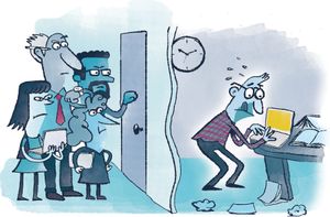
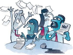
Loving @mSutters’s illustrations in @kevinmhoffman’s new book, Meeting Design, which promises to be excellent. rosenfeldmedia.com/books/meeting-…
Scheduling a disciplinary hearing for Adobe Illustrator. Let me know if you’d like to attend.
💡 Great tip: to test fallback CSS in modern browsers, misspell a feature query:
@supports (display: ggrid) { … }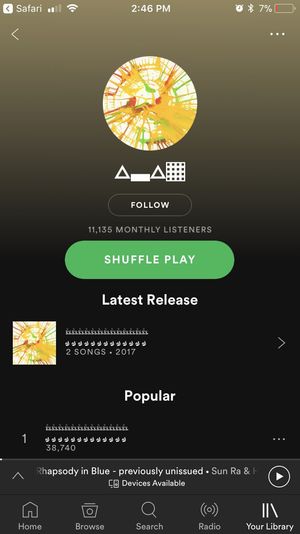
I guess @d_carson_design is making music now? open.spotify.com/artist/1RtQ5z4…
“It’s like designing a house so it’s easy to build, instead of setting up cranes typically used for skyscrapers.” frankchimero.com/writing/everyt…
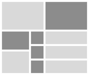


My week.


Everyone please continue making colorful geometric confections and I will continue admiring them. thisiscolossal.com/2018/02/lauren…
I’m looking forward to learning more and adapting to Grid’s way of thinking, but this first obstacle is a surprise and a bummer. twitter.com/robweychert/st…
Tinkering with CSS Grid. Does grid-gap not accept fr values? I want my gutter widths to be relative to my column widths.
Links: January 2018
Hello, dear reader!
January is gone, but its links remain.
In my little corner of the internet, I posted a roundup of my favorite stuff from 2017 (including a look ahead at plans for 2018). As a subscriber, you may be especially interested in the stats I compiled about the 299 links I shared last year.
I released my first open source software project, Column Setter, a Sass tool for building custom responsive grids that… See more →
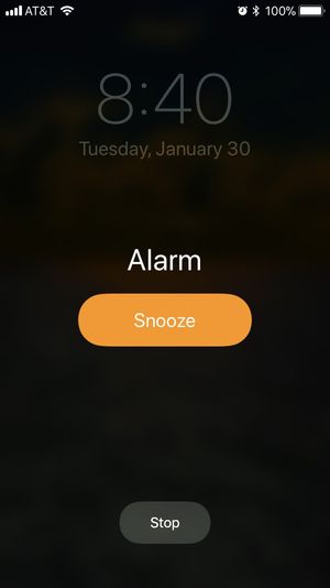
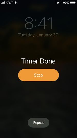
Yes, the likely actions are Snooze the Alarm, Stop the Timer. But the buttons’ inverted functions across modes mess with my head every time.
Hello! I like the World Economic Forum logo. That is all.