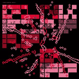
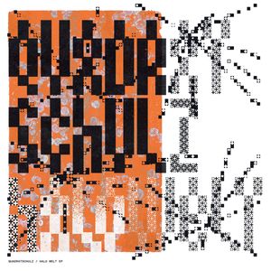
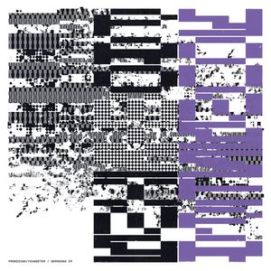
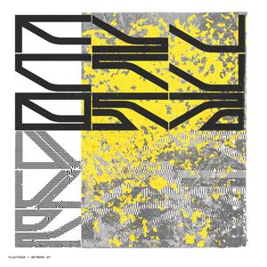
The absorbingly impenetrable typography of Analogical Force and Geometric Love
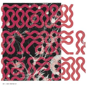
Analogical Force, an electronic music label based in Madrid, found its way onto my radar earlier this year when I picked up Oh Mr. James’s fun I’m Not Here EP. Most of the label’s output honestly doesn’t do much for me, but its design is another story, which for the last several years has largely been handled by the UK-based Geometric Love, a.k.a. Steve Hyland. I especially enjoy Hyland’s fearless lettering, which is almost entirely unburdened by legibility. Juxtaposed as it is with collages of pixelated noise, nature photography, and painterly textures, the work feels like a maximalist update of the digital-native aesthetic that emerged on record sleeves and rave flyers of the 1990s.