Claire Tabouret’s Stained-Glass Windows for Notre-Dame Divide French Society, with a Legal Threat Looming
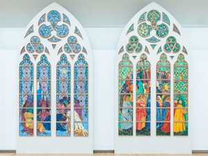
A project has been in the works for a couple years to replace a number of Notre-Dame’s stained-glass windows with contemporary designs, which has unsurprisingly caused an uproar. While the arguments for and against generally take familiar shapes—whether historic architecture should accommodate modern expression, whether these decisions should be top-down or community-driven—one functional aspect of the kerfuffle caught my attention:
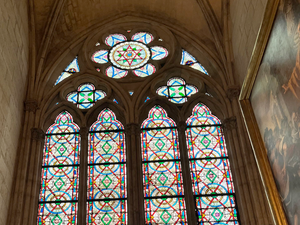
The windows’ light gray, non-figurative glass allows more light to enter the cathedral, achieved via its contrast between light grays and colorful accents. The goal was also to “create a homogeneous system that governs the entire cathedral,” Bressani said. “That’s what Viollet-le-Duc was concerned about: bringing an overall coherence in the color and lighting system of the cathedral.”
He added that the bright contemporary imagery of Tabouret’s designs would “destroy the overall experience of the Gothic cathedral.”
However, that argument is apparently something of a straw man:
Blistène, the head of the jury that selected Tabouret, bristled at this accusation. Indeed, the artist chose her colors so that when combined together, they would form a white light, he said. (The cathedral also asked her to maintain the interior’s overall, existing lighting.)
“Saying that Claire Tabouret’s proposal destroys the harmony of the existing windows,” Blistène said in an email, “is truly a case of not wanting to recognize that, on the contrary, her proposal is extremely respectful of the theme and its iconography, of the colors and the light emanating from the building.”
Whichever side is right, I’m a little ashamed to admit I hadn’t previously given much thought to stained glass as a conscientious participant in a church’s lighting design. I guess I always thought of liturgical stained-glass windows as site-specific art that lighting designers would have to work around, rather than a collaborator in their process. In particular, the concept of a window’s color composition serving both a narrative/figurative purpose and projecting a functional, aggregate white light is pretty mind-blowing.