Close Date Expand Location Next Open/Close Previous 0.5 of 5 stars 1 of 5 stars 1.5 of 5 stars 2 of 5 stars 2.5 of 5 stars 3 of 5 stars 3.5 of 5 stars 4 of 5 stars 4.5 of 5 stars 5 of 5 stars Repeat Slide Current slide

V7: The “viewport” meta tag

Apparently it is still necessary!

The first thing I did when setting up this new version of my site was to put together some minimum viable HTML templates. Here’s the blog post template:

<!DOCTYPE html>
<html lang="en">
  <head>
    <meta charset="utf-8" />
    <title><!--POST TITLE--> | RobWeychert.com V7</title>
    <meta name="description" content="<!--POST DESCRIPTION-->" />
    <link rel="alternate" type="application/rss+xml" title="RobWeychert.com V7" href="/index.rss"/>
  </head>

  <body>
    <header>
      <h1><a href="/">RobWeychert.com V7</a></h1>
      <nav>
        <ul>
          <li><a href="/blog/">Blog</a></li>
          <li><a href="/index.rss">RSS</a></li>
        </ul>
      </nav>
    </header>

    <aside>
      I’m redesigning my site in public from the ground up, so if it looks
      undercooked, that’s why! Check out the <a href="/blog/">blog</a> to follow
      the process step by step, or visit the more polished
      <a href="https://v6.robweychert.com/">current version</a> of the site.
    </aside>

    <main>
      <header>
        <h2><!--POST TITLE--></h2>
        <p><!--POST DESCRIPTION--></p>
        <time datetime="<!--YYYY-MM-DD-->"><!--POST DATE--></time>
      </header>
      <!--POST CONTENT-->
    </main>

    <nav aria-label="Secondary">
      <h2>Most recent blog posts</h2>
      <ul>
        <li>
          <a href="/blog/<!--YYYY/MM/POST TITLE SLUG-->/">
            <h3><!--POST TITLE--></h3>
            <p><!--POST DESCRIPTION--></p>
            <time datetime="<!--YYYY-MM-DD-->"><!--POST DATE--></time>
          </a>
        </li>
      </ul>
    </nav>
  </body>
</html>

The site is, for the time being, made exclusively of HTML, so I didn’t bother to test it on different devices since browsers would apply their own default styles. But then I noticed it was doing this on iOS:

Screenshot of a shrunken blog post in iOS Firefox
iOS shrinks the page, treating it as if it were designed specifically for desktop browsers.

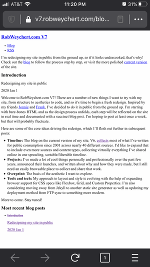
It turned out my minimum viable HTML wasn’t quite viable after all! I had left out the <meta name="viewport"> tag from the <head>. It’s been part of my HTML boilerplate for years, and I’ve always generally understood what it does, but this incident prompted me to learn a little more. After digging around a bit, I found an in-depth two-part post from Peter-Paul Koch on how browser viewports work with device pixels and CSS pixels. I also found Apple’s documentation for configuring the viewport using <meta name="viewport">. Both of those posts appear to have been published around 2010, but much of the information is still relevant.

Due to the complexity of the subject, those posts are illuminating if not quite elucidating, but here’s the gist: When the iPhone was first released, Apple proudly trumpeted its ability to bring mobile users the “real” internet: not the stripped down mobile versions of websites that were de rigeur at the time (on the rare occasions developers even bothered making them), but the “real” versions that you would see on a desktop computer. It rendered these desktop-optimized sites by assuming they were approximately 980 pixels wide and shrinking everything to fit on the iPhone’s screen, which was 320 pixels wide. The user could then zoom and pan the page to get a closer look. This was a reasonable compromise, but it meant that if anyone tried to optimize a site’s design for a mobile device, that page would likewise be shrunken when rendered on the iPhone. So Apple created the <meta name="viewport"> tag, which would give developers control over how their work was rendered on the iPhone. Other mobile browser makers subsequently adopted it, making it a de facto standard.

Fast-forward more than a decade and no one thinks of the desktop as the default way to experience the web anymore, so I thought I might be able to get away with omitting <meta name="viewport">. Apparently not! Maybe someday. In the meantime, you can see the aforementioned Apple documentation for details on how to use <meta name="viewport">, but this should cover you in most cases:

<meta name="viewport" content="width=device-width, initial-scale=1" />
Screenshot of a correctly rendered blog post in iOS Firefox
No more shrinkage!

All posts in this series

V7: Introduction

Redesigning my site in public

Welcome to RobWeychert.com V7! There are a number of new things I want to try with my site, from structure to aesthetics to code, and so it’s time to begin a fresh redesign. Inspired by my friends Jonnie and Frank, I’ve decided to do it in public from the ground up. I’m starting with bare-bones HTML and as the design process unfolds, each step will be reflected on the site in real time and documented… See more →

Go to this post

V7: The “viewport” meta tag

Apparently it is still necessary!

The first thing I did when setting up this new version of my site was to put together some minimum viable HTML templates. Here’s the blog post template:

<!DOCTYPE html>
<html lang="en">
  <head>
    <meta charset="utf-8" />
    <title><!--POST TITLE--> | RobWeychert.com V7</title>
    <meta name="description" content="<!--POST DESCRIPTION-->" />
    <link rel="alternate" type="application/rss+xml" title="RobWeychert.com V7" href="/index.rss"/>
  </head>

  <body>
    <… See more →
Go to this post

V7: Content priorities

Making my projects more visible

I added a tiny bit of CSS to aid readability by keeping line lengths in check on larger viewports:

body {
  margin: 0 auto;
  max-width: 75ch;
  padding: 1rem;
}

When calling the CSS file from the page head, I include a query string based on today’s date, which I’ll update when the CSS is updated. This will let updates get past the browser’s cache.

<link rel="stylesheet" href="/assets/css/main.css?20200108" />

Hopefully this small stylistic addition will keep things tidy enough until I properly begin the visual… See more →

Go to this post

V7: Structural challenges

The ambitous scope of the timeline section

Most of this redesign’s structural challenges pertain to the timeline section, previously described thusly:

  • Timeline: The blog on the current version of my site, V6, collects most of what I’ve written for public consumption since 2001 across nearly 40 different sources. I’d like to expand that to include even more sources and content types, collecting virtually everything I’ve shared online in one sprawling, sortable/filterable timeline.

Since the projects section is a higher priority and the new… See more →

Go to this post

V7: Timeline section inventory

Untangling the content

Progress on the redesign has slowed, partly because I’ve been busy with other things, and partly because, frankly, the open questions about the timeline section enumerated in my previous post are an intimidating mess, a perfect example of the early stages of the Design Squiggle.

In a fight or flight situation like this, here are the arguments for flight:

  • “Uh, the timeline isn’t even your top priority for the site, remember? What’s more important: working on… See more →
Go to this post

V7: The timeline is taking shape

Making progress with sketches, wireframes, and a prototype

Though it’s mostly taken place in scattered, stolen moments, I’ve made a lot of progress on the UX of the timeline section, much of which was still a disconcerting mystery not so long ago.

With the help of the data categories and content inventory I established in the previous post, I’ve settled on a binary timeline concept: each post is either small or large. Small posts consist of up to 100 words and/or up to… See more →

Go to this post

V7: On dependency

How I incorporate other people’s work into my own—and how I don’t

I might have expected quarantine life to be a boon to my site’s redesign process since most of my preferred social distractions were nullified. Instead, I’ve been using the time in isolation to make music videos, finalize a home purchase, move into said home, and try to find my place in our national reckoning on racism and public safety reform. But as I slowly shift some of my attention back to the redesign, I’ve been… See more →

Go to this post

V7: Choosing a CMS

Do my new content requirements need a new content management system?

For awhile, I had basically resigned myself to the idea that the massive amount of stray content I’m planning to bring home (thousands of tweets, Flickr photos, etc) would necessitate moving my site onto a LAMP stack CMS. I started poking around in WordPress, which I hadn’t touched in years, and Craft, which I use regularly in my work at ProPublica. The former felt bloated and the latter’s setup presumed a level of back-end know-how… See more →

Go to this post

V7: Beginning data migration

Prepping hundreds of tiny blog posts for republishing

Apropos of nothing, I decided that the first of the old entries I’d bring over to V7 would be granular ones:

  • Daily Haiku: A section of the fourth version of my site, beginning back in 2005. As the name suggests, I wrote a haiku every weekday based on the Dictionary.com Word of the Day. Each haiku was originally its own entry, but when I brought them over to V6 a few years ago, I consolidated… See more →
Go to this post

V7: Renewed purpose

Goodbye, Twitter

It’s been nearly two years since I posted an update on this project! I’ve been moving it forward slowly and quietly since then, and I’ll share some details about those activities in due time, as well as details about how work and life changes have introduced new and different demands on my time and somewhat expanded the scope of the site. But for now, the most important takeaway is that my fundamental vision for V7… See more →

Go to this post

V7: The Procrastination Destination

Working on my site instead of yours

I’ve given my V7 redesign project the unofficial tagline “The Procrastination Destination” since the significant progress it’s seen in the past few months has come mostly in stolen moments, some of which turned into extremely productive (and perhaps troublingly obsessive) deep dives. This recent movement has been pretty non-linear, and the tasks in play are all interdependent enough that none of them are really done until all of them are, but I seem to be… See more →

Go to this post

V7: Eleventy it is

Switching static site generators

Every static site generator has idiosyncrasies, and Eleventy is no different. As is the case pretty much any time I try out software, I find that Eleventy often does things differently than I think it ought to, and it doesn’t always make itself as clear as I think it could. A couple of examples:

  • Eleventy has no built-in mechanism for date-based archives. A common blogging convention I’ve adhered to for many years involves organizing post… See more →
Go to this post

V7: Expanding scope

Bringing more data and functionality into the mix

In my previous post, I mentioned Tinnitus Tracker, my standalone concert diary site which can be browsed by genre, artist, venue, city, state, and year. I had been planning to continue updating that site concurrently with V7, but it recently occurred to me that it makes a lot more sense to just consolidate the two sites, which in hindsight seems incredibly obvious.

For one thing, I’ve never been satisfied with the Tinnitus Tracker design, and… See more →

Go to this post

V7: Metadata structure and sitemap

Solidifying the information architecture

I’ve been revising a metadata structure for blog posts and a sitemap for a few months now, and since I haven’t felt the need to tweak either of them in awhile, they’re probably solid enough to document here.

Metadata structure

The blog post metadata has been developed to accommodate a wide variety of post types, to give me a lot of flexibility in how to present them, and to give users a lot of options… See more →

Go to this post

V7: The Great Data Migration

Bringing it all home

I’ve done a lot of work on the site in the last two months, and a launch date, while still a ways off, is finally coming into focus. I’ve been working on this redesign very intermittently for over four years now, but at this point I expect to keep at it until it’s done, with as little interruption as possible.

Among other recent advances, I’ve moved the site from Jekyll to Eleventy, chosen a font… See more →

Go to this post

V7: The Great Data Migration, Part 2

Once more, with feeling

From the beginning, it was clear that data migration was going to be this redesign’s biggest, most cumbersome task, as the site was growing from 600-some blog posts to untold thousands. I assumed that reformatting the mountain of data arriving in disparate configurations from over a dozen external sources (as described in my previous post) would be the lion’s share of the work, and it would be smooth sailing from there. How wrong I was!… See more →

Go to this post

V7: Launch day

Expanded site, new design, same me

I started redesigning this site in January of 2020. Remember January of 2020? We didn’t know we were living in the Before Times. There were still a few people in the White House who weren’t Fox News hosts or meme coin shills or raw milk evangelists. Our tech bro billionaires hadn’t yet entered the endgame of their persistent campaign to annihilate whatever sense of objective reality we once shared. We were so young.

I wouldn’t… See more →

Go to this post